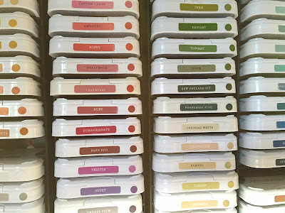
I put little inked dots on the fronts of all of my ink pads.
I labeled the pads that had no label showing.
And the swatches! There were swatches to be made.
Swatches of die inks . . . swatches of distress inks noted with little stars . . . swatches of pigment inks, noted with little hearts. And my ombre ink pads?
So happy to be done. I couldn't wait to get back to stamping (although I think my next project might involve some serious re-inking of dry ink pads).
So here is a card I created this evening for Color Throwdown.
This one started as bokeh. Such a fun card.
Loving those little fish!
So good to be creating . . . and with organized inks!
Cheers!
Supplies
Used - Keep Swimming
Cardstock:
Bazzill, Neenah and Bee Watercolor
Stamps: Best
Fishes from Simon Says Stamp, minis4circles and award2stamp from The Stamps of
Life
Dies: Fish and
Bowl from Simon Says Stamp
Ink: Distress
Markers, Simon Says Stamp White Pigment Ink, Hero Arts Black Ink, Stampin' Up
Other: Gansai
Tambi Watercolors, Sequins and Google Eyes from Pretty Pink Posh


Great job of organizing your inks and the swatch books. I need to make a swatch book. I can really see the value of it because some inks look different when they are stamped and a project can get messed up thinking the label color is the ink color. Don't ask how I know this!! lol
ReplyDeleteYour underwater scene is simply stunning!!! The bokeh background looks awesome and I love the little fish!!! I am so impressed with your ink organization..looks like a lot of work but so well worth it!!!! Maybe you need to pay me a visit...LOL!!! Anyway...thanks so much for playing along with us at the Color Throwdown!!!
ReplyDeleteThat's quite the extensive collection of inks you have there! LOVE your beautiful organization of them! I'm so glad you took some time out to play along with us at the Color Throwdown! Your fishes are wonderful in their underwater playground!!
ReplyDelete